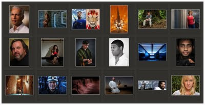
As a lighting photographer, you have a significant amount of control over the tones and colors in your photos. How does that control affect your photography?
Do you know?
Do you care?
A few thoughts, after the jump.
__________
Use of Color as a Signature
How many times have you walked past a magazine at a newsstand and somehow knew who shot it before you even took a closer look?
You might have recognized the palette of colors as being the signature of a particular photographer.
Greg Heisler uses a rich, deep colorful palette. Annie Leibovitz used to be Miss Superaaturated, but has become much more subtle in recent years.
Dan Winters is fond of those muted blue/green/grays, which is one of the ways you can spot him from a mile off. Ditto Joyce Tennison and her desaturated hues.
Have you ever taken a moment to try to figure out your palette? You likely have one, whether you know it consciously or not. And it goes a long way towards defining your personal style.
If you are not conscious of it, you might be settling into something you don't really want by default. That is what was happening to me. Or you might be all over the map when what you really want is to develop a signature look. And that's not very productive, either.
Using light brings with it the ability to drastically alter the color palette of a photo. Between using gels for your various sources, and the backdrop or locations you choose, that whole extra layer of control is one of the best reasons to be a lighting photographer. And if that control is evolving in a happenstance kind of way, you may be shortchanging yourself.
Taking a Step Back
A little while ago, I took a look at my recent work and came to the conclusion that I was defaulting towards rich colors and saturation. It's not something I necessarily wanted to be doing, either. But things were just ending up that way.
I think it was most likely because of my background as a newspaper photographer. Back then, when we had the ability to control a scene (portraiture, illustration, etc.) we tended to crank the color to make up for the fact that we published on what was essentially toilet paper. I can't ell you how many bad newspaper illustration I have seen that looked like they just stepped off of a Cyndi Lauper video from the 1980s.
And not that there's anything wrong with trending toward saturated colors in general, either. That's just not necessarily where I am wanting to be right now, if I take a moment to approach it consciously. Maybe it is the long-term reaction to leaving newspapers, where 'subtle' was not in our vocabulary. On the web, it starts to look heavy-handed.
And one photo at a time, my tendency toward heavy use of color is not something that would have been noticeable to me. It's one of those things that sneaks up on you, like when your brakes go bad. But in looking at my photos as a group, I am starting to make some different decisions both in how I am lighting and (to a lesser extent) my post processing. I have been trending a little more towards neutrals when designing and lighting photos. No definitive new look has evolved that I can see. But at least I am not always turning the volume up to eleven all of the time.
Maybe this is the first time a photographic color palette has even entered into your thinking. If so, you might want to spend some time looking at the work of photographers who you admire and seeing what you can learn about them -- and yourself.
No great truths being dealt here. Just an offhand reminder to be aware of -- and in control of -- your overall approach to color and tone. And to make sure you keep an eye on the big picture (and not just all of the little ones) if it is important to you.
No comments:
Post a Comment