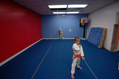
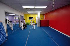
 Reader Joseph S. will be photographing kids sparring against each other in this room at a karate studio. He posted a question on the Flickr threads looking for advice from other readers on how to design the lighting.
I want to think through this one out loud and walk through what I would do and why. But first, take a moment to think how you might approach this shot.
Hint: The first problem you'll need to solve has absolutely nothing to do with light. Solutions (mine, at least) after the jump.
First, The Bad News
 Problem number one: How to keep the little guys from accidentally destroying your lighting gear.
Problem number two: How to light the room to where they can move around and still be in good, consistent light.
Problem number three: How to get the light over the heads of the other spectators, and have your stands out of their way, too.
Now, The Good News
The first thing that jumps out at me in this room is that red wall. Sweet. That's a ready-made backdrop, as far as I am concerned.
I will definitely want to use that if I possibly can. In fact, I will choose my shooting height and direction based on keeping that wall as a full backdrop if possible. That means compromising best I can between wideangle (for full body shots up close) and long lens (to keep the wall filling the frame as much as practical) as I shoot.
I'll be shooting along the room divider area opposite the red wall. I will likely be moving left and right as I shoot, staying low, so I am always shooting on a line perpendicular to the red wall. That will keep my red backdrop as large as possible. (Shooting on the angle makes it shrink with distance because of angular perspective.)
The main thing I want to do up top is not to let the ceiling line creep into the photo. So I shoot from an angle as low as possible, and zoom in until the two people just fill the frame. So my first choice would be a wide-to-short-tele zoom for this session.
Also, as far as the background is concerned, is anyone else seeing the possibilities for some cool, specular background portrait shots? Even action portraits. Nice.
Other good news: We have a white, low ceiling. That is going to solve our height issues very easily.
So let's look at three lighting possibilities, each related and each very easy to change to one of the other two options at a moment's notice.
Joseph said he will be using Vivitary 283's and Pocket Wizards. All three of my choices use two speedlights (more powerful lights if you can get your hands on them, or ganged speedlights if you have four flashes) aimed up into the ceilings near room corners.
The ambient exposure in the room is reported to be 1/80 at ASA 400. That means at ASA 400, shooting at 1/250th at f/2.8 is going to underexpose the ambient-lit portion of the shot by 1.7 stops. Perfect. We will shoot at 1/250th at f/2.8 at ASA 400 and try to light the sparring area to f/2.8 at ASA 400.
If you are going to use the ambient as a component of the exposure, you'll have to green your flashes. Then you set your camera to fluorescent white balance and everything reverts to white. Or close to it, at least.
So, here is my thinking, in order from safest to edgy.
Option Number One: Safe Light
You cannot hide from this light, and everything will look good. The light will be very even across a large area in the center of the room. As they move away from center, one light becomes main and the other becomes fill. Lots of room for error in this setup. As they get very close to the ends of the room, it'll brighten up a little. Test this out beforehand, and know at roughly what point on each side you need to move to f/4.
If that sounds hard, it's not. Try it.
As for power, I would put the greened flashes on 1/2 power and point them up at the ceiling at either a 50mm or 35mm beam spread. Do not point them straight up, or the colored walls will catch some light and color your light in a bad way. Aim them a little out into the room. But not so much that the kids catch any raw light.
(I am assuming he has VP-1 modules on the 283's, which allow a Vivitar 283 to go manual power, since he typically lights with these flashes. If not, choose the yellow auto setting. It is the closest to what you need, aperture-wise, and it should be consistent as the flashes are seeing the same scene all of the time.)
Set up your lights and shoot your hand in front of your face as you walk around the room to test various areas, like this.
I start with 1/2 power as it gives me a better recycle time than full power. If you can get f/2.8 at half power, you're fine. If it is brighter than that, power down your flashes until you get an f/2.8 reading in the center of the room. This will buy you some shorter recycle time.
If the lights are not bright enough, I would bump up to ASA 800. Don't worry - ASA 800, lit, looks way better than you'd expect. If you still cannot get ASA 800 at 1/2 power, go to full power and wait out your recycle. Good (NiMH) rechargeables will help you out there, giving you a 3.5-to-4-second recycle time on full power.
If you cannot get ASA 800-f/2.8 at full power, walk your flashes in some along the wall behind you. Or get more light.
Oh, here's the other thing I do ASAP. Commandeer the mattress in the room and use it to protect whatever corner flash is most likely in the line of fire for the kids. Do not even ask. That's right, all your mattresses are belong to us.
If anyone asks, which is doubtful, tell them that it is for the safety of the kids. This, they cannot argue with. No need to mention that you are simply trying to make sure the little dealers of death do not screw up your speedlights.
Option Number Two: More Interesting
But it is even more important to move laterally to keep that background perpendicular as you shoot. Now you have a flash/stand and/or ceiling hot spot to watch out for. But the light will look better.
Option Number Three: Edgy
But remember, the light is mostly side light. And it is soft and coming from above. Most important, the ambient light is less than two stops below the flash-lit stuff. So the shadow areas will be muted but very visible.
But the caveats from the last lighting scheme are doubled, as you have potential lighting stands and ceiling hot spots creeping in from both sides. You may want to tighten up your zoom a little and shoot in close. But these shots could turn out to be far more interesting than the option other two options.
So, what would you do differently? Hit Joseph with your ideas in the original Flickr thread.
And if you have environments that you are trying to decide how to light, throw up a question of your own. And pix of the area are always a bonus.
No comments:
Post a Comment